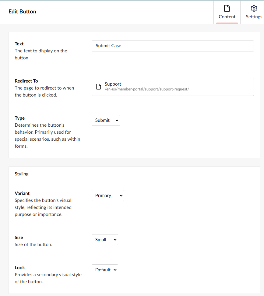
The Button Widget provides a simple way to add calls to action to a page. Buttons can be configured to navigate users to another page, website, file, or other destination, or to submit a form.
| Property | Description |
| Text | The text to display on the button. |
| Redirect To | The page to redirect to when the button is clicked. |
| Type | Determines the button’s behavior. Primarily used for special scenarios, such as within forms. Default (Button?) The button has no default behavior, and does nothing when pressed by default. Client-side scripts can be added to listen for the element’s events and perform custom tasks. Submit Submits the HTML form in which it is placed. When used within a Dataverse Form, the submitted field values are sent to Dataverse for processing. Reset Resets the values for all fields on a form. (field must be placed on a form) Go Back Used in conjunction with the Go Back Redirect setting in a Form Widget configuration. When configured and placed on a form, the Go Back button redirects the user to the preconfigured page. |
Styling
| Property | Description |
| Variant | Specifies the button’s visual style, reflecting its intended purpose or importance. |
| Size | Size of the button. |
| Look | Provides a secondary visual style of the button. |
Example
Configuration: