
The Text Field widget represents a Dataverse Plain Text column.
General
| Property | Description |
| Maximum Length | The maximum number of characters allowed for the text input. This is set by default to the value as found on the column in Dataverse. |
| Field Type | Setting a field type determines the type of data that can be entered and validated in the input. Email Validates that the text has a valid email syntax. URL Validates that the text begins with https:// or http:// |
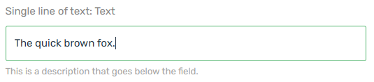
| Description | The description appears below the field on the form. |
Formatting
| Property | Description |
| Format | Default Postal Code Phone Number |
| Custom Format | Sets a custom pattern mask: 0 – any digit. a – any letter. * – any char. [ ] – make input optional. { } – include a fixed part in an unmasked value. ` – prevent symbols from shifting back. Other characters will be fixed. For regular expression start and end with ‘/’. Note: When multiple pattern masks are created, the system applies them from top to bottom. Note: Pattern masks take precedence of the Format option. |
Protection
| Property | Description |
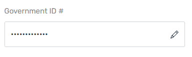
| Sensitive | When checked, the value displayed in the field will be hidden. By clicking the edit icon, the user can change the value. {add more details about the usage here} |
Examples
Text field with description.
Text field with “Sensitive” property enabled.
Note: Rich Text fields are not supported in this version.